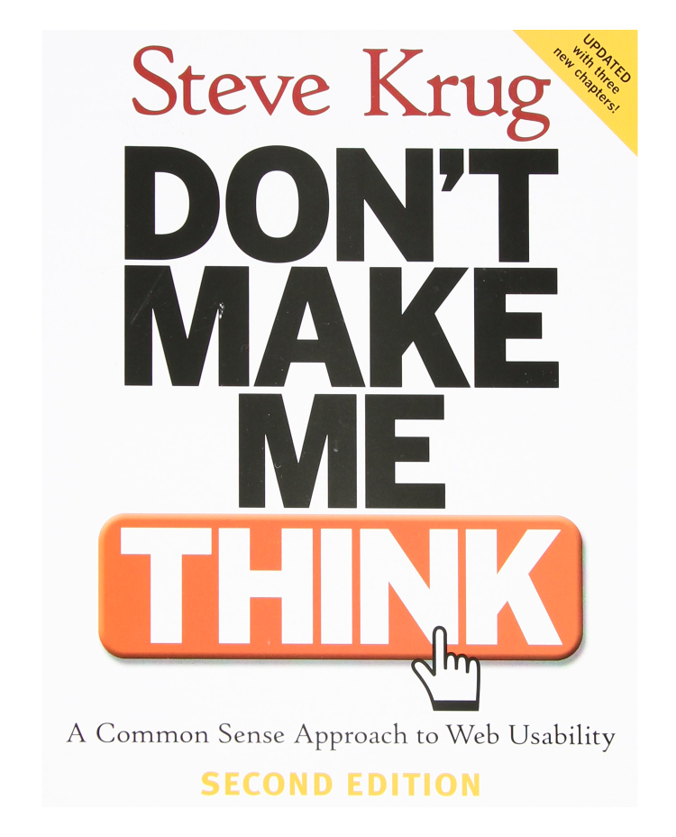

I’m teaching a course at NJIT this semester and the next couple of weeks I get the opportunity to talk about usability as it relates to web design and development. The course uses Don’t Make Me Think by Steve Krug, which is a really great choice for the reading material. I highly recommend picking up the most recent edition of his book.
This week we focus on some guiding principles in user experience and usability to gain some building blocks for future week’s discussions. Earlier in the semester we learned about color and layout as well as a long focus on web development processes (HTML/CSS/Git + GitHub/Liunx Commands) so now they get to learn how to apply it all correctly.
Don’t make me think
People don’t like it when they have to make even simple decisions. If project teams building web sites/applications don’t care enough to make things obvious the confidence level quickly evaporates and people will look elsewhere for their browsing pleasures.
How we really use the Web
The truth is if we find something that works, we stick to it. Most of the time we are simply scanning pages for keywords we are looking for, then click whatever link that catches our attention or resembles what we originally came to the site for. Once we find something that works we will repeat those steps no matter how painful it was the first time, with no regard to a simpler path’s existence.
Billboard Design 101
With an understanding of how people really use the web and they are likely going to be very quickly scanning your pages there are five important things the book recommends you do to make sure they see—and understand—as much of your site as possible:
- Create a clear visual hierarchy on each page
- Take advantage of conventions
- Break pages up into clearly defined areas
- Make it obvious what’s clickable
- Minimize noise
Animal, vegetable, or mineral?
It doesn’t matter how many times I have to click, as long as each click is a mindless, unambiguous choice.
–KRUG’S SECOND LAW OF USABILITY
Omit needless words
As stated by Krug, Happy talk must die. Happy talk is like small talk – content free, basically just a way to be sociable. Since we know most our our users don’t have time for small talk; they want to get right to the beef. You can – and should – eliminate as much happy talk as possible.
Get rid of half the words on each page, then get rid of half of what’s left.
–KRUG’S THIRD LAW OF USABILITY
Next week’s lesson
I’m looking forward to going deeper in to how the class can begin to fix usability issues within their current projects.